SOME ART
SOME ARCH
An Architecture Adventure
Hi, Welcome to my art journey!
I am an architecture student, and here some of my works and some pieces that i admired.
Arch_201
Arch_102
INTRODUCTION TO ARCHITECTURAL DESIGN
MODULOR STUDY

AS_02
AS_02 Revised
AS_04.2
AS_03.2


Arch_112
ARCHITECTURAL COMMUNICATION TECHNIQUES II
M1
MW HOUSE
by Jorge GARIBAY

M1-3
Orthogonal Drawing Set on AutoCad

M1-4

M1-4
Revised
1/200 Scale Model of MW House

M1-5
Expressive Section Drawing

M1-6
ARCH_101
Basic Design


FINAL EXHIBITION

JURY _02

First Construct
Revised Construct


First Poster
Second Poster

SERIES OF VOLUMES

First Rhino

Revised Rhino

First Model

Revised Model
AS_07
Group construct which has different 5 models


New version of the construct which revised by me

The Poster

The Compostion
JURY _01
SP_01
Well-defined Volume and Complex
AS_01
DESIGN OPERATIONS
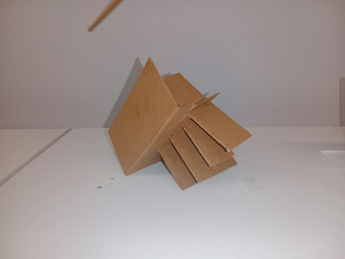
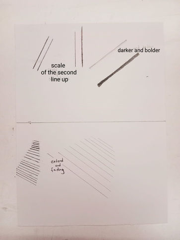
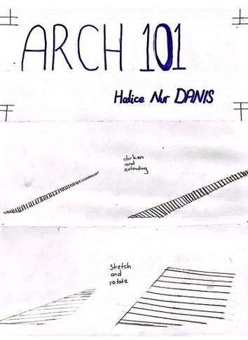
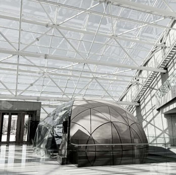
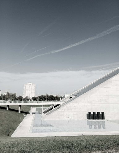
First two pictures have diffarences in terms of shade and shadows. However, these diffarences can be described by design operations such as extending, stretching and rotating as sketched below in catalog.
Revised Construct
First Catalog
Revised Catalog
Layering of a Facade, Constructing the Layers
AS_01
(The Farmhouse, Chris Precht)
First Layer: Dominant element, giant triangles
Second Layer: Little usual triangles
Third Layer: Little upside down triangles
Fourth Layer: Parallellograms
Fifth Layer: Opaque triangles
First Version of Construct
Revised Version of Construct

ARCH_111
Architectural Communication Techniques
MT_1/ MT_1BONUS/AS_11
MIDTERM_1

SW_3

AS_06/SW02

SW_1

AS_05/AS_07
Steltman Chair
Steltman Chair, designed by Gerrit Rietveld in 1963 for the renewed interior of a jewelry store called "Steltman" in The Hague, Netherlands, met with the users again on the 50th anniversary of its design. Designed as an asymmetrical pair that forms mirror opposites of each other, the chair is upholstered with faux leather in its original design. The design is offered in its new version called “Steltman Chair Limited Edition”, covered with felt or genuine leather.


Poster Design
AS_04

AS_03
Orthographic Projection

AS_02
Abstracting the Image


AS_01
my Views of CSO
ARCH_121
Introduction to Architecture

ORNAMENT and AUSTERITY
ADOLF LOOS
Chapter 2
Each architect has a different opinion about ornaments. While some of them don’t care about opinions which against their own opinion, Adolf Loos has a narrow idea about the ornamentation. He defends that ornamentation only results in waste of human labor, money, and materials. Moreover, he adds that ornamentation brings with it the permanent reflections of cultural characteristics that will not be compatible with future versions. “There was a time when the painter and sculptor had a clear idea of their link with the architect: they were all three “visual” artists. The art of the painter and sculptor, however, was imitative of nature: that of the architect was only partially so. Architecture imitated, yes—but imitated culture.” (RYKWERT,1975) Since Architecture is visual, people connect it with beauty or overdesign rather than utility. This misunderstanding leads people to architecture should be mere ornament. However, there is the thin line between a sculpture and a building. A building cannot be replaced easily when ornaments go out of fashion or time.
Now i understand better, when our instructors reply with "You are not sculptor." when we said " I designed as it is because it is more aesthetic."


